I'm an avid camper/hiker and an overall nature lover, I wanted to design this app concept as a utility tool. The app itself is a locator for nearby trails with an option to save those favorite trails that you come back to again and again. I thought of it as a tool for hikers to have; with lots of information about the trails and a feature to download the trail map, so it can be viewed offline for locations that don't have reception.


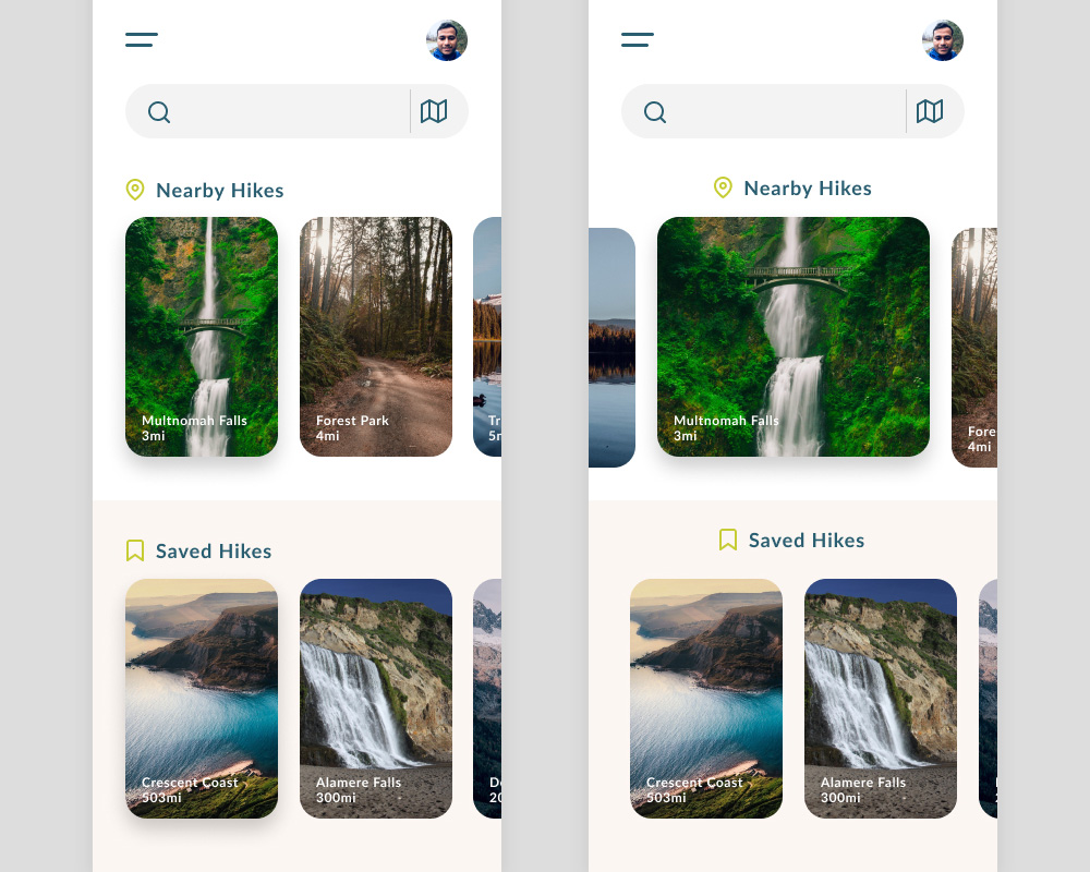
The photography is key for highlighting each trail card to set a mood of tranquility but also a sense of adventure. I had initially made the width of each trail card shorter to show more cards on the screen, but I opted to show them one at a time. The wider card gives more space for the photography to shine and there won’t be that many trails to swipe through on any given location.
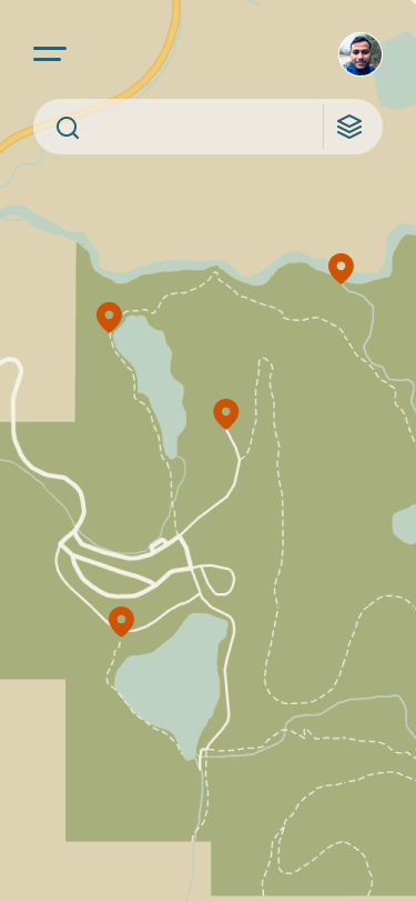
Just a little bit of UI for the search bar. It switches between card view and map view. A simple but effective scale animation where the stack of cards flattens vertically while the map unfolds horizontally, I love doing this little bit of contextual animation.

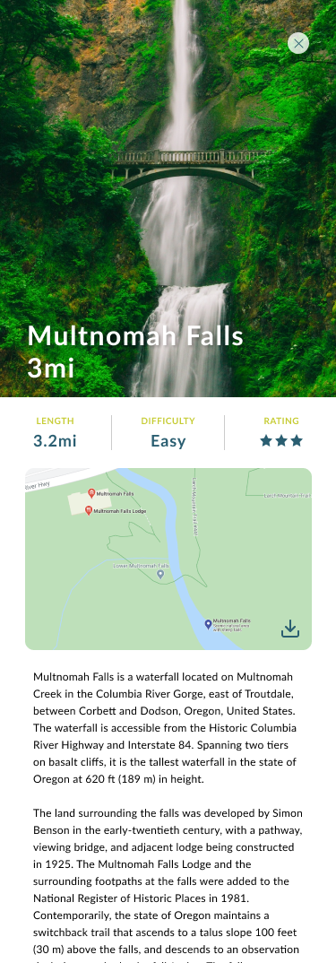
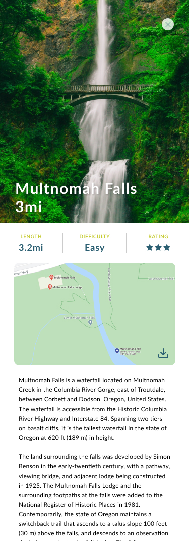
The trail card is the main piece of the puzzle here. The key info about a trail is placed prominently, followed by a downloadable map so hikers can access it even without phone reception. And of course the photography spotlights key points of interests.
