When my wife and I were expecting our first child, we were given a booklet to track the baby’s bowel movements and feeding. Of course there are already apps that do such data tracking, but I wanted to design something that addressed the pain points that I encountered while using such apps. Mainly, how do I make an app for sleep-deprived parents fumbling around with possibly only one free hand (or maybe even just one finger) to work with?
Design System
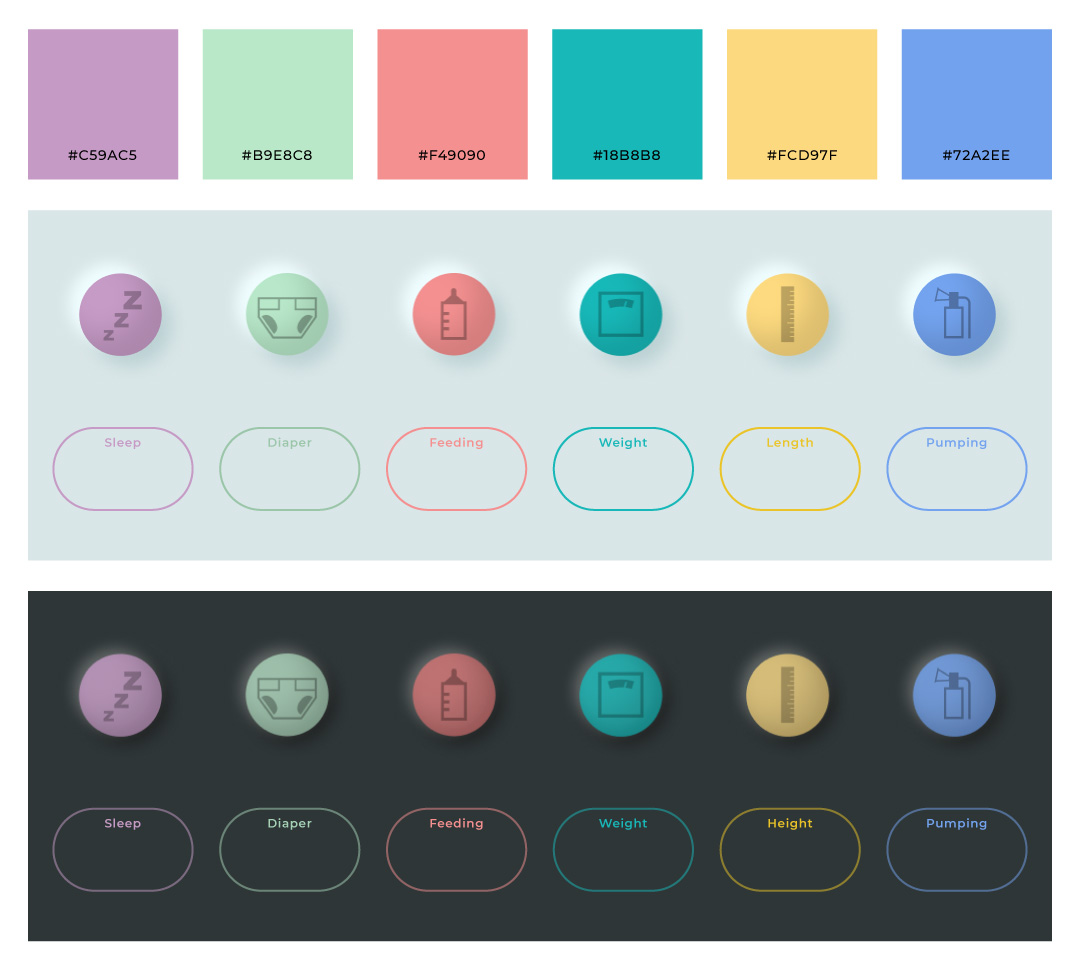
The main structure of the system revolves around the set of colors that indicate each measurement. The intention is for the user to be familiar with the colors so they don’t even have to look at the symbols or read its name. That’s why the colors need to be consistent on the button and information bubble. I also used these colors to compose the logo.
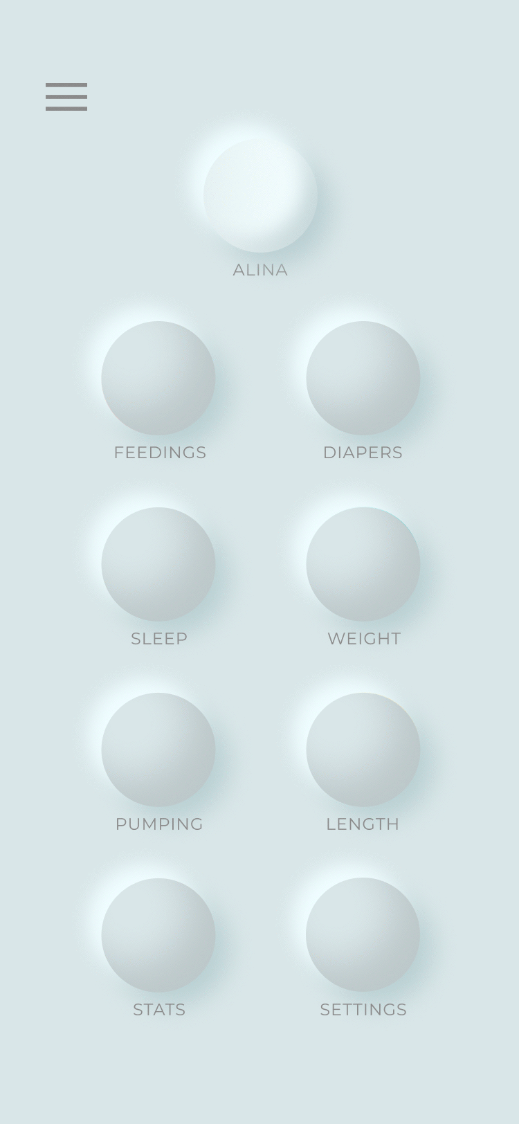
I went with Neumorphic buttons to demarcate a clear separation between buttons and information. I wanted the navigation and call-to-action buttons to be as clear as possible. I specifically avoided drop shadows since it made the main navigation too busy. Using this kind of three-dimensional looking navigation is just a better solution of making buttons stand out without making it look like everything is floating and casting shadows.
The main home buttons’ placement are customizable so each parent can choose which piece of data they want to track. This can constantly change as the baby grows up. In our case, we were mostly concerned on our newborn’s bowel movements and if they are regular. Then as our daughter grew up, we became more focused on her sleep schedule.
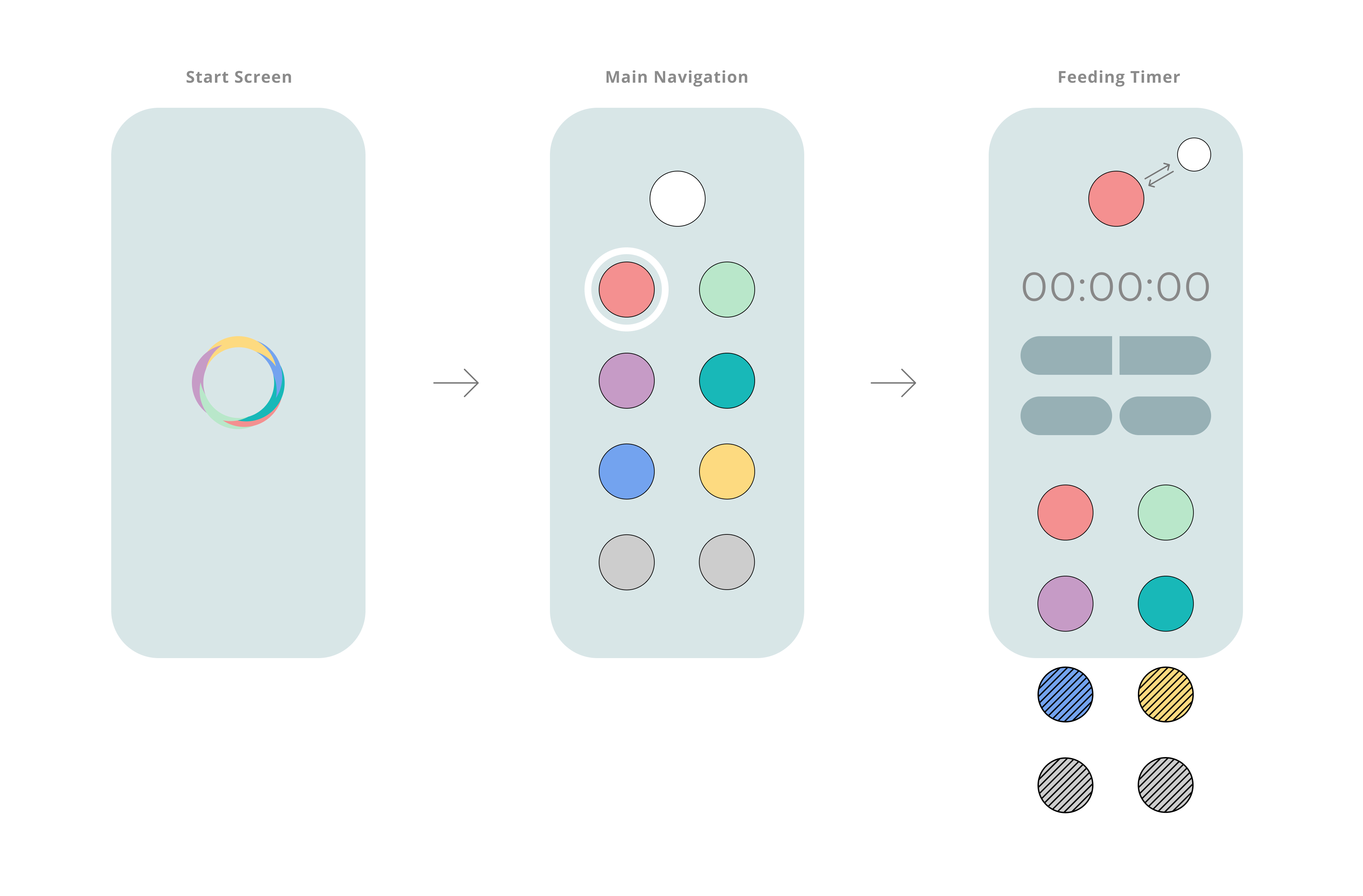
User Flow
The home buttons are always accessible on the bottom of the screen and can be expanded by swiping up. I wanted the animations to be quick and snappy as to be unobtrusive. But I still wanted the animation to be smooth so that users are able to track where the buttons go; keeping that visual language that the home buttons are ever-present.
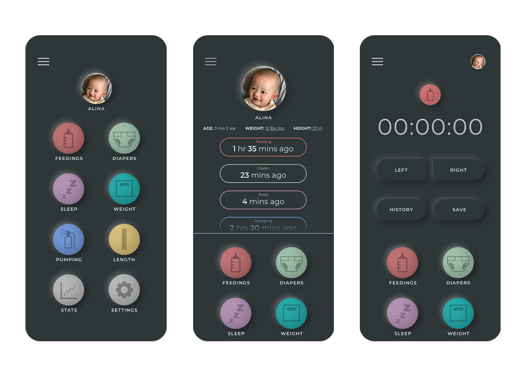
Dark Mode
I know from experience that a lot of data tracking will have to be done in cover of night or whilst holding a sleeping baby. To prevent accidental baby wake-ups from a bright screen, I designed a Dark Mode that will lessen screen brightness but will still be easily visible by the user. This can be set manually or automatically triggered through time settings or ambient lighting.
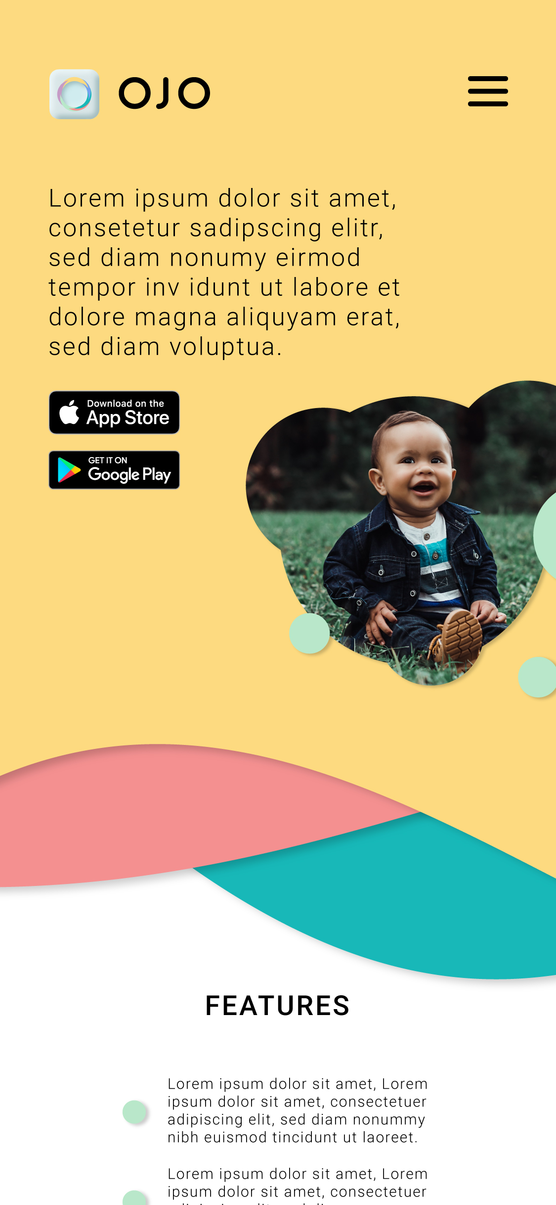
I’ve also designed an app page to go with this fictional app. I wanted to show how dynamic the site is, so I created the scroll experience using After Effects. I quite enjoyed thinking up the different accessories that could work with the app for this high fidelity prototype, like the smart home assistant integration.