As part of Gap Inc’s UX Design department, I was assigned to a small two-person team that is handling the community page for Athleta. AthletaWell is essentially a forum type site that was launched using an out-of-the-box theme that was slightly altered. As part of the redesign, an outside design firm has provided us with a new brand style guide. Our task was to create a design system to fit that style guide and creating a more engaging experience for users.
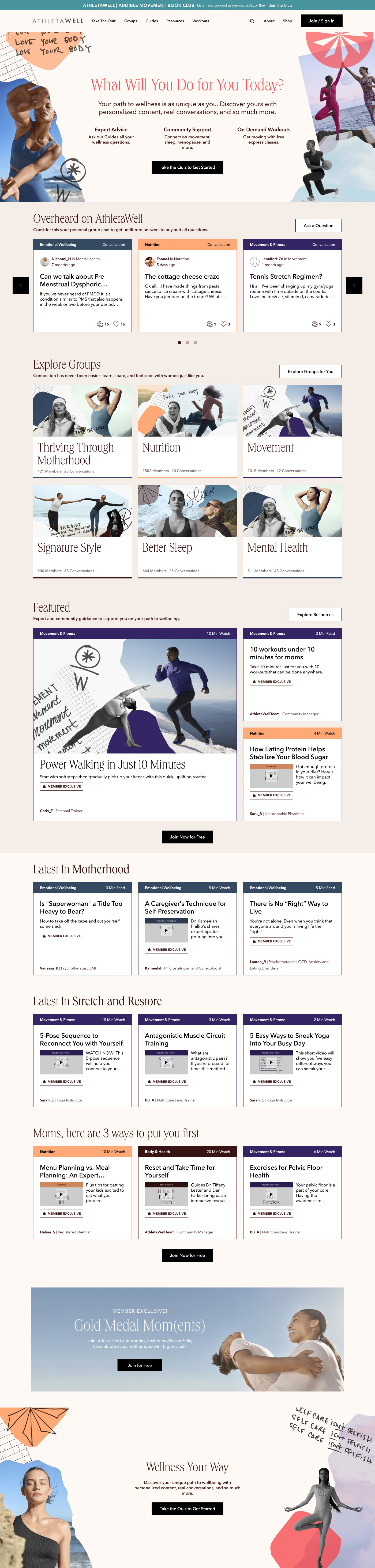
Early Version | The original version of the site was a default theme that came with the CMS platform that is running the forum. The redesign is also an opportunity for the team to restructure the information architecture of the site to be bucketed to the AthletaWell's 5 wellness territories: Movement & Fitness, Nutrition, Emotional Wellbeing, Body & Health, and Rest & Recharge.
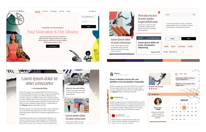
Style Tiles | To kick off the implementation of the new brand look, I was in charge of creating and presenting “style tiles” to the head of AthletaWell and Athleta brand's creative director. The ultimate result is an agreed upon common ground between creative and UX that will work for the UI of the platform. The result of the excercise was a style that leans more on the first option with squared-corners and flat elements with a little bit more whitespace.
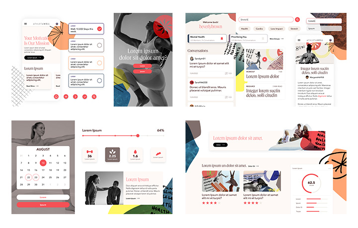
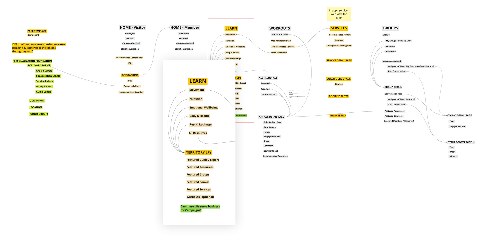
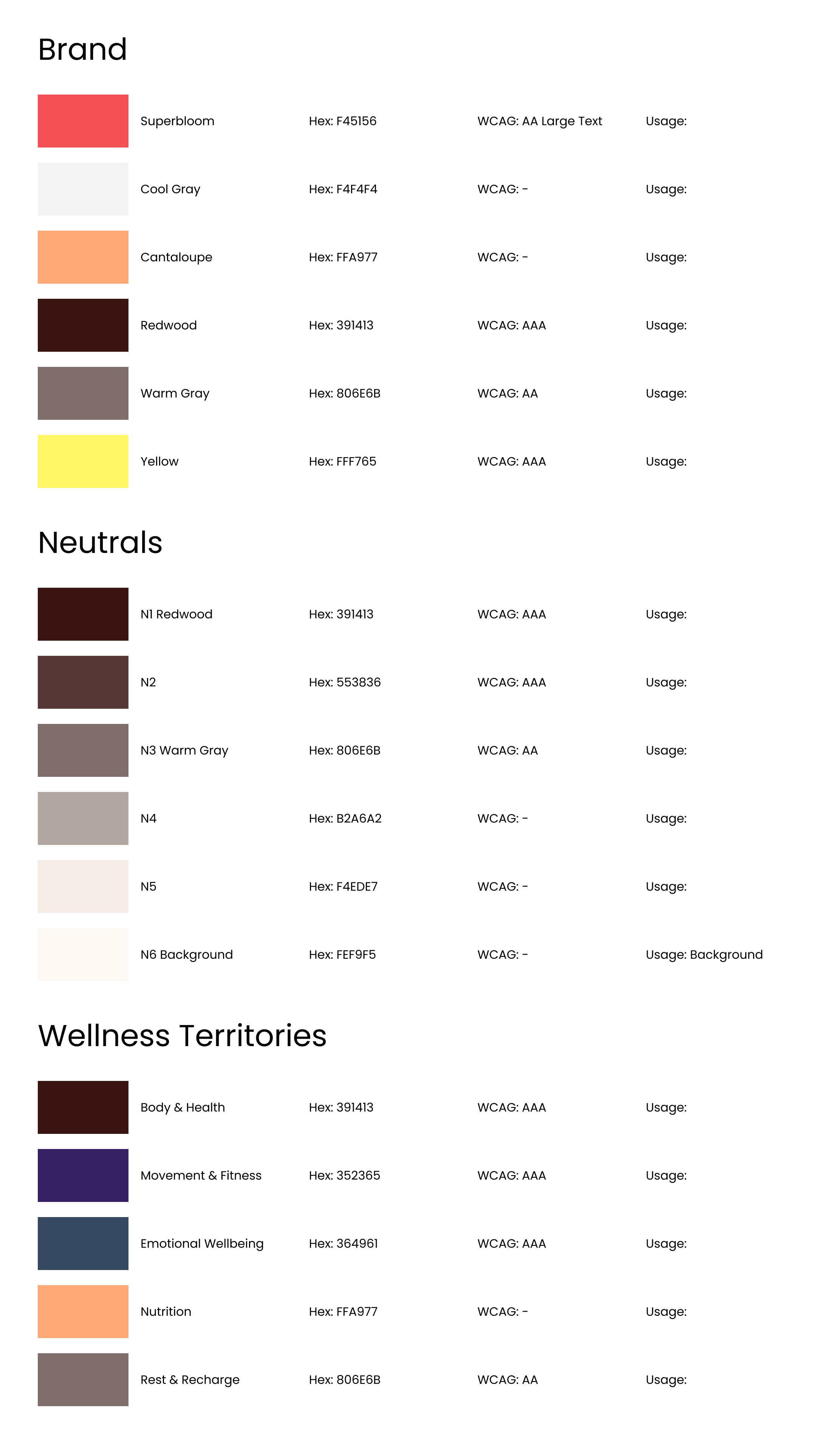
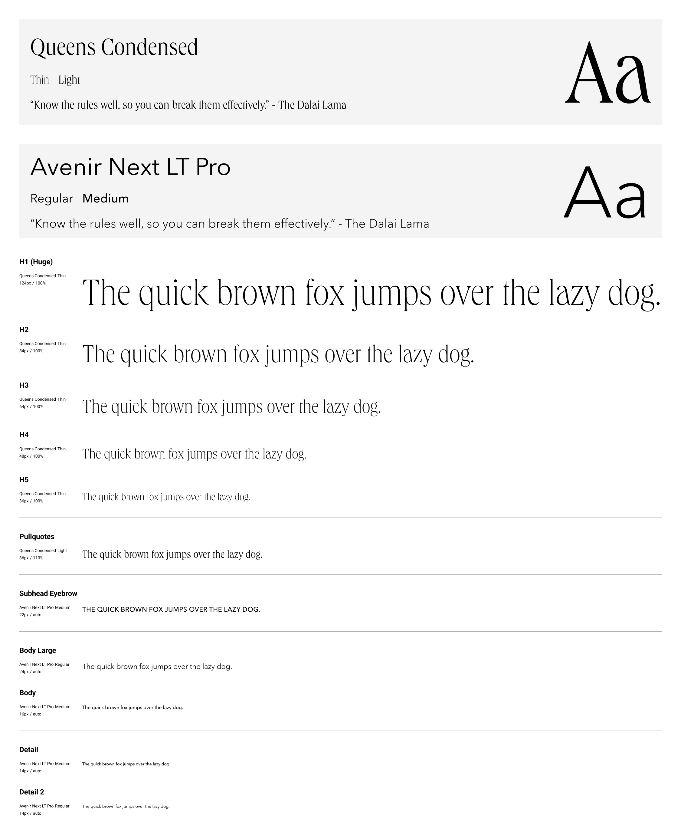
Design System | With the help of a brand styleguide provided by an outside agency, we have a good starting point for creating the design system. Along with the standard items like font and color, I took inventory on the different components we would need from initial wireframes. The events component is grayed out because it was out of scope for the MVP.
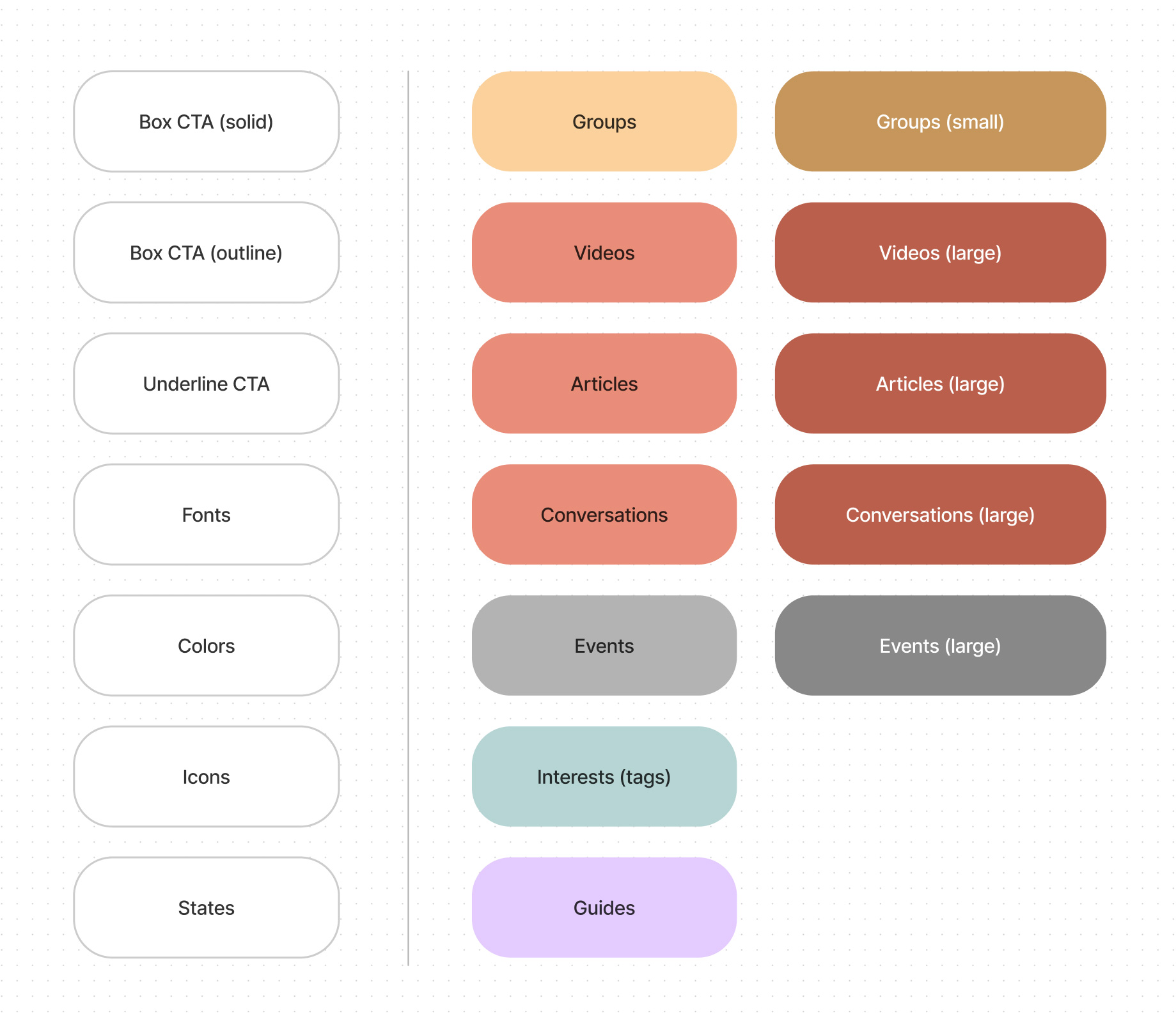
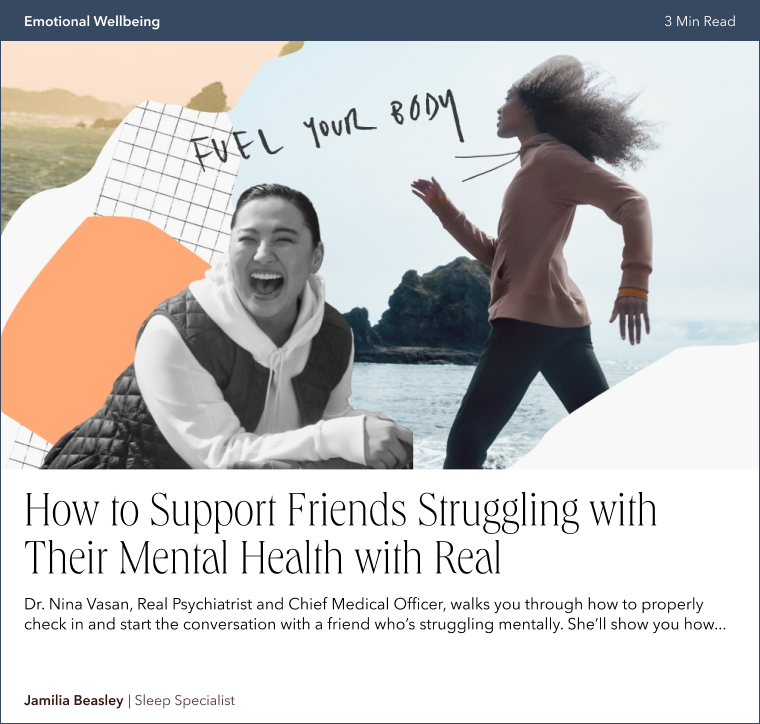
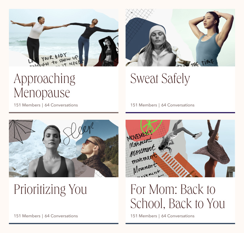
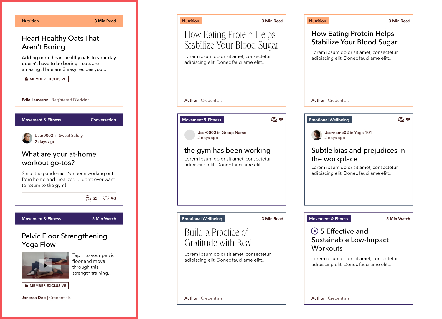
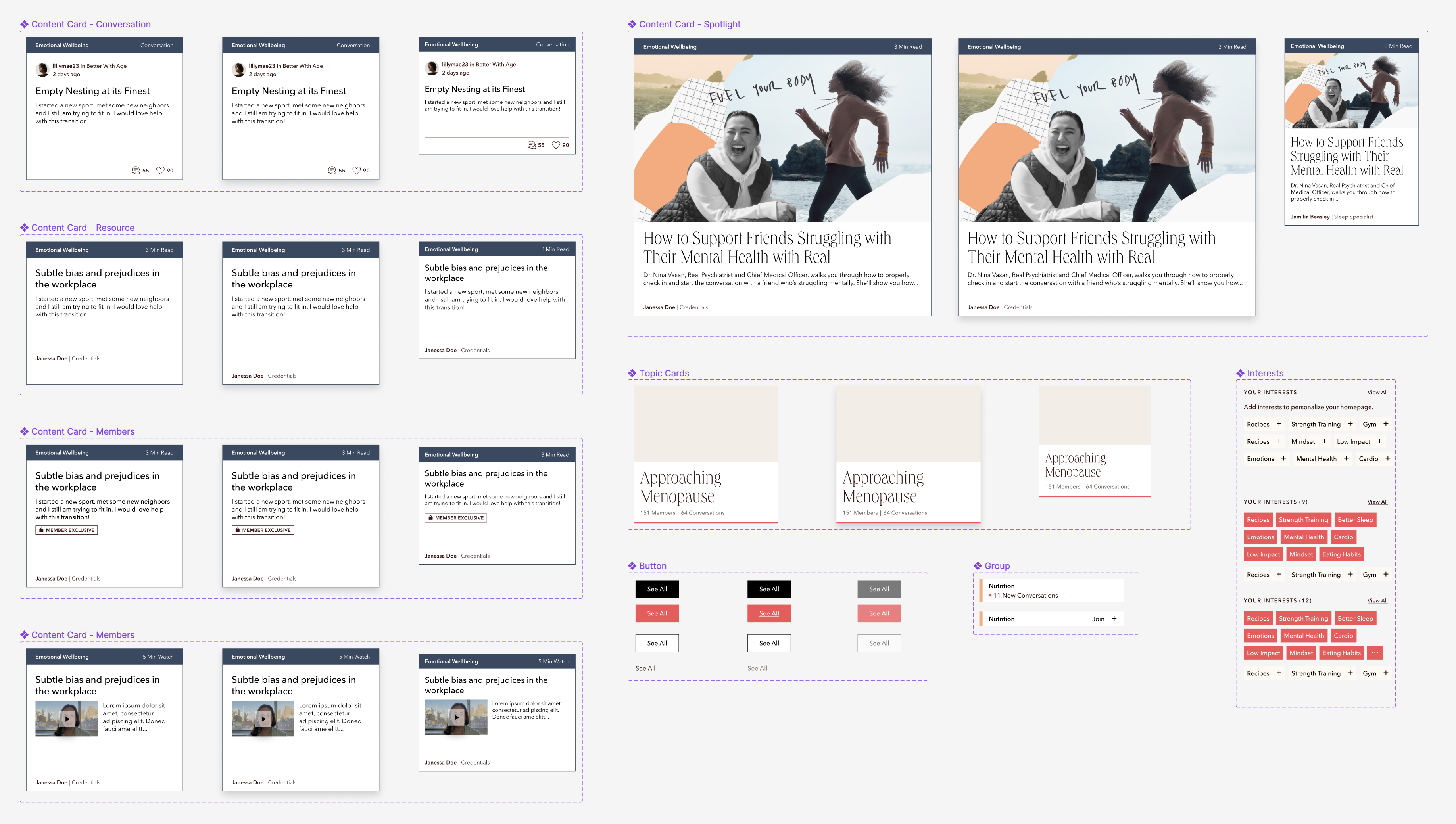
Components | One of the most important parts of the UI are the content cards (the left-most column is the final version). We wanted the information on the site to be compact and identifiable while still hold lots of information; it was also important to have this information be modular so it can exist in different page contexts. From there, I built out the component system with proper variants.
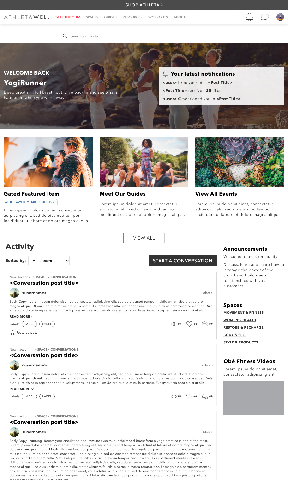
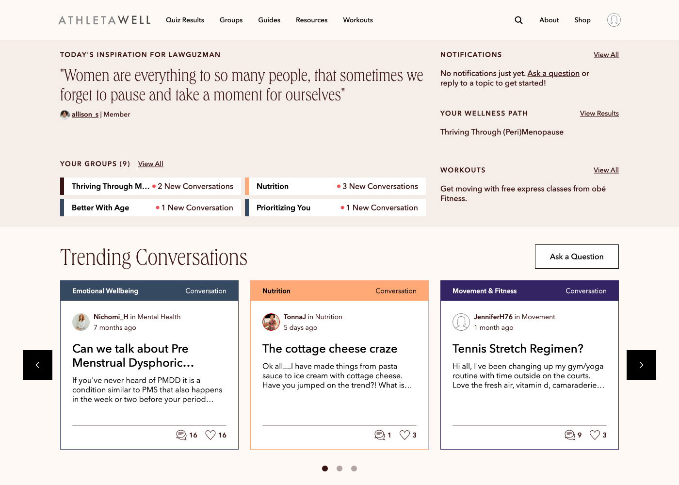
Member's Homepage | The member’s version of the homepage has a very similar layout to the visitor’s homepage but tweaked to show more personalization, giving users more reason to engage and return to the site.
Key Takeaways | The redesign completely established, not only the UI of the platform, but what the tone of the site is going to be. It presented a safe and trustworthy space for users to be able to open up and share with the community. The content cards clearly state what will be contained in that particular resource. The information is organized and less cluttered providing easy navigation for new and current users.