The main project for Google's UX Design course on Coursera is designing an app from scratch using the design process. The only thing provided for us students were a selection of user bios to start the discovery phase of the project.
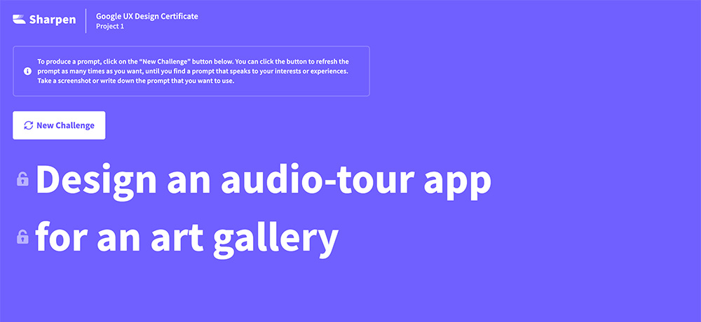
At the start of the project we were directed to a site with a random prompt generator which gives out ideas for an app. I got this prompt on creating an audio-tour app for an art gallery.
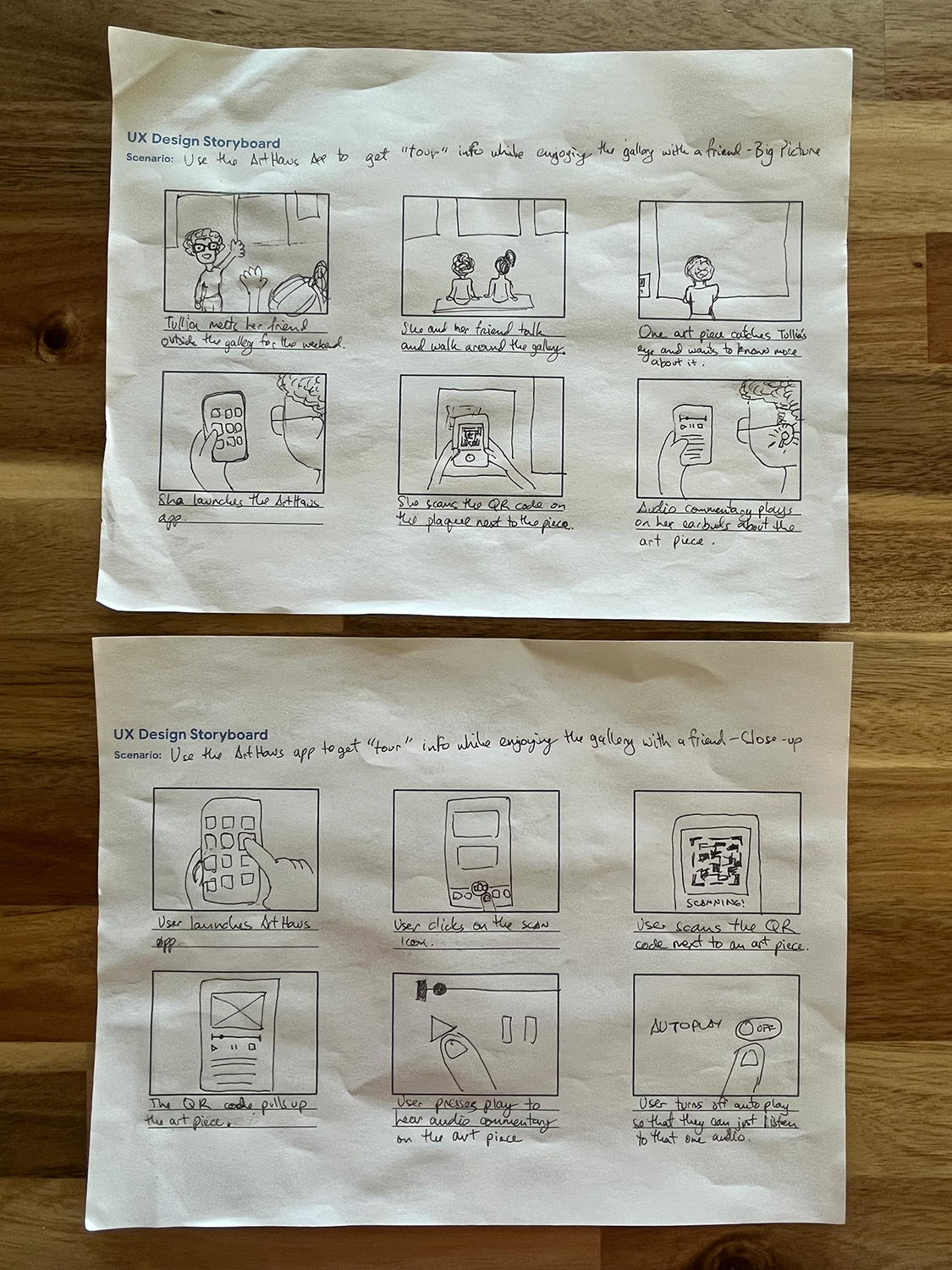
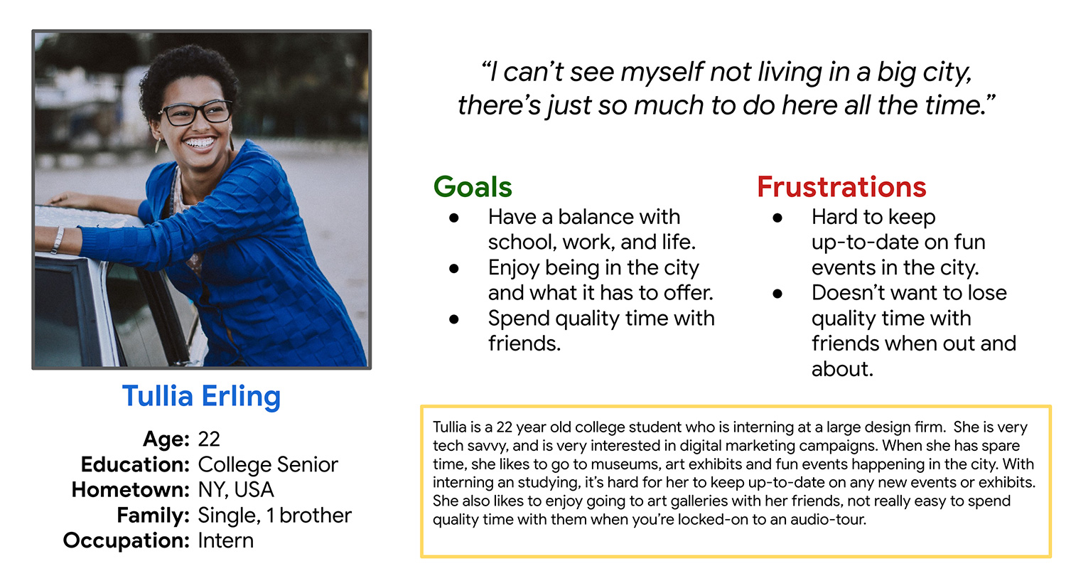
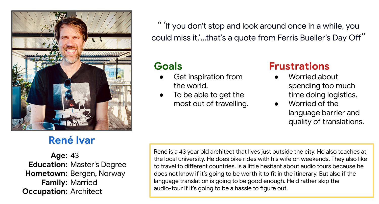
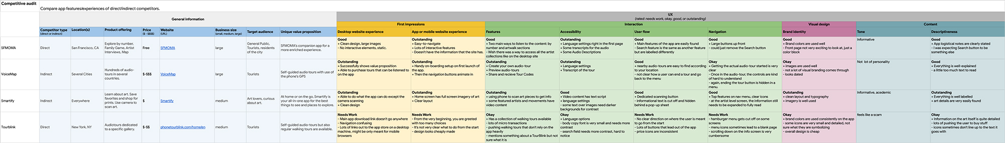
Research | For the course, Google provided us with some initial user profiles where I was able to create a couple of user personas. Using the personas, I was able to draw up some big picture and close-up storyboards and was able to narrow down some key screens from a whole bunch of sketches. And along with a competitive audit of 4 direct and indirect competitors I was able to use this foundational research to design some initial wireframes.
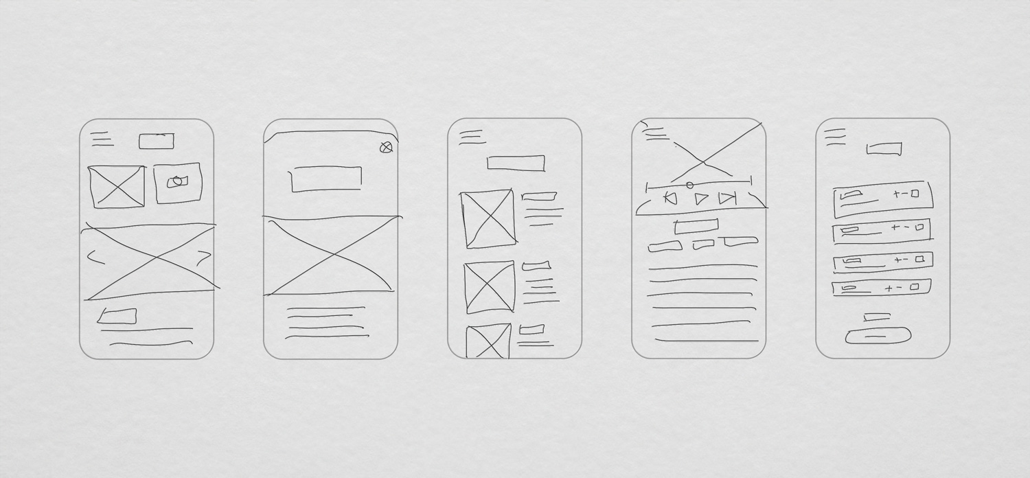
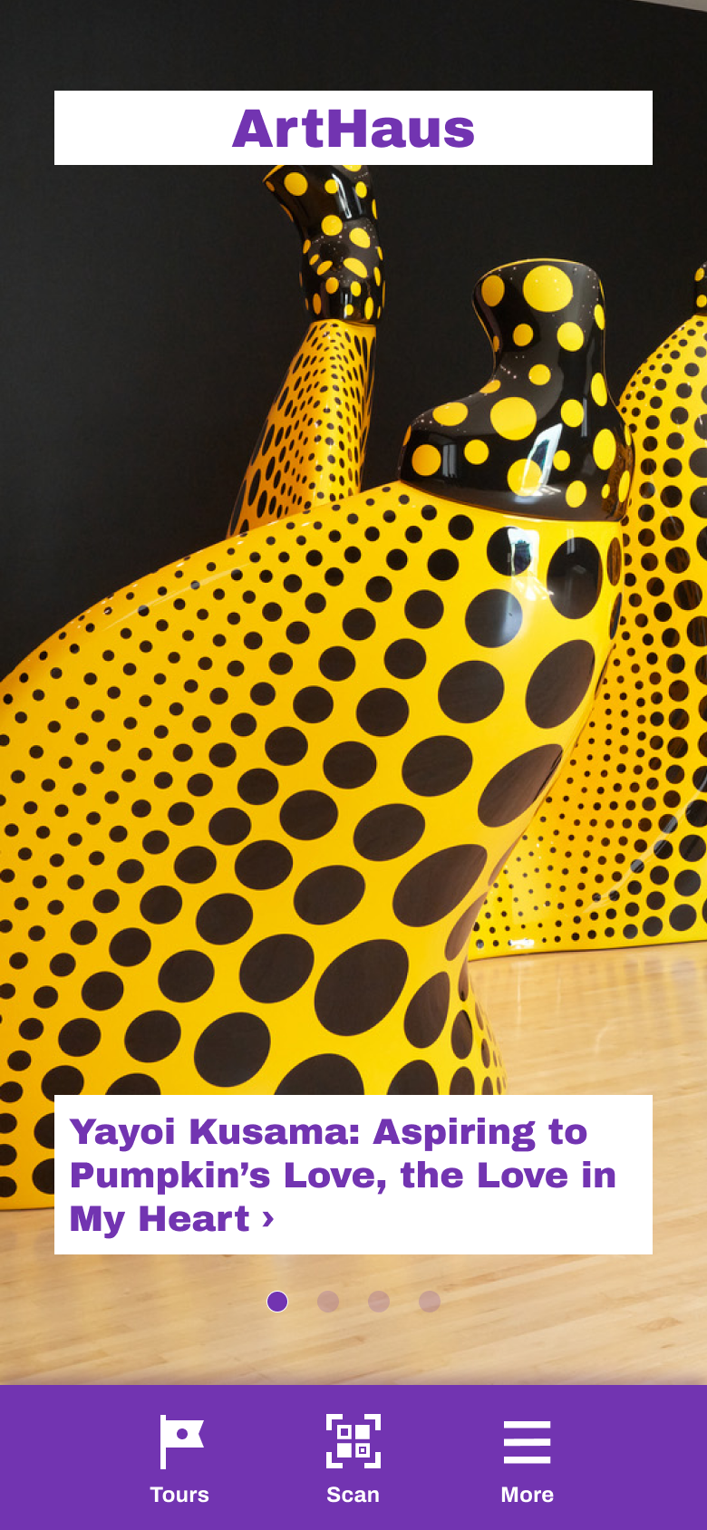
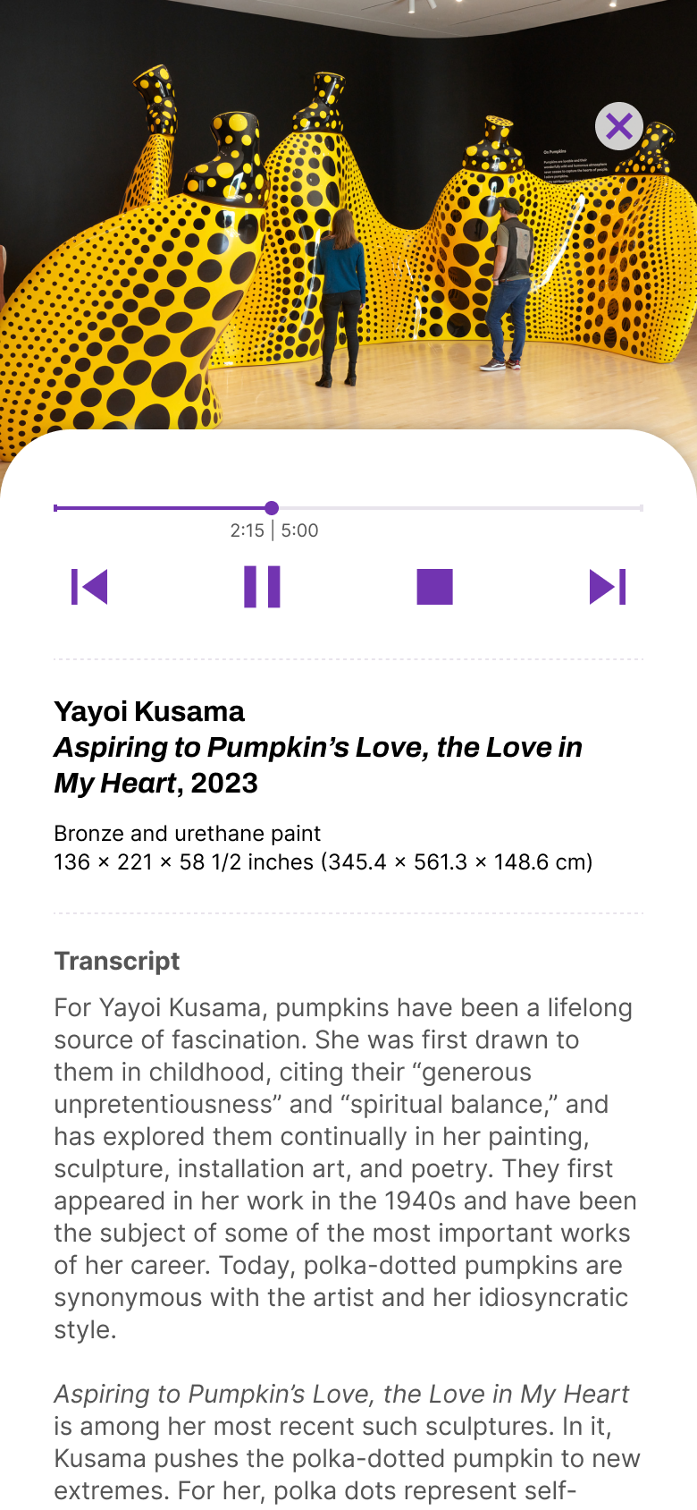
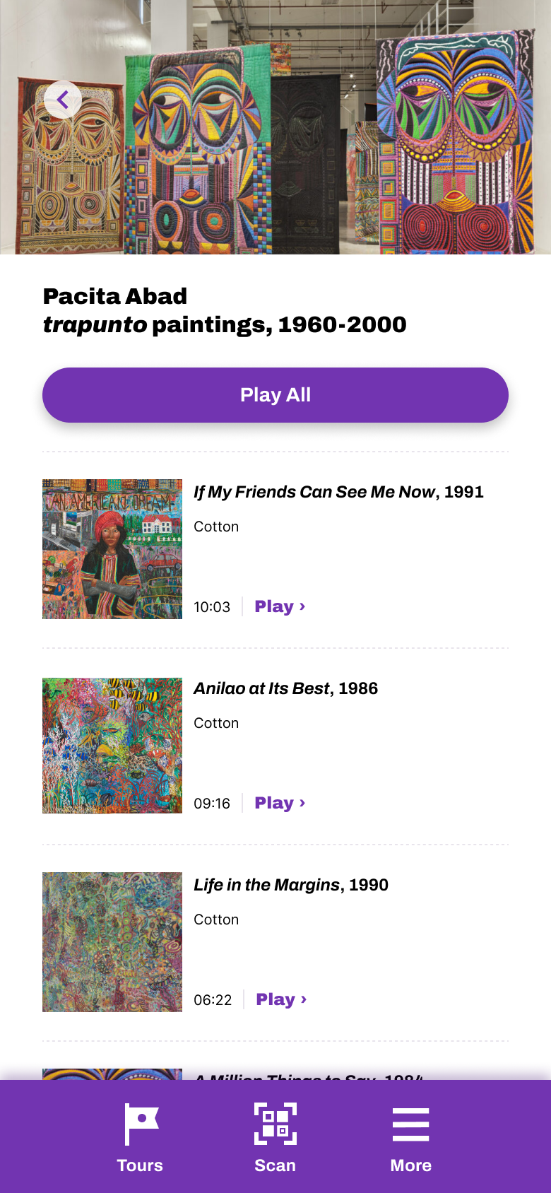
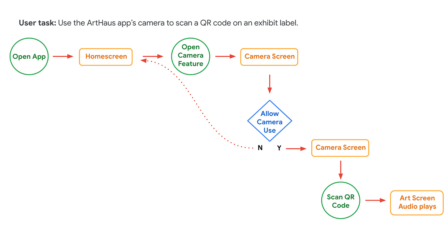
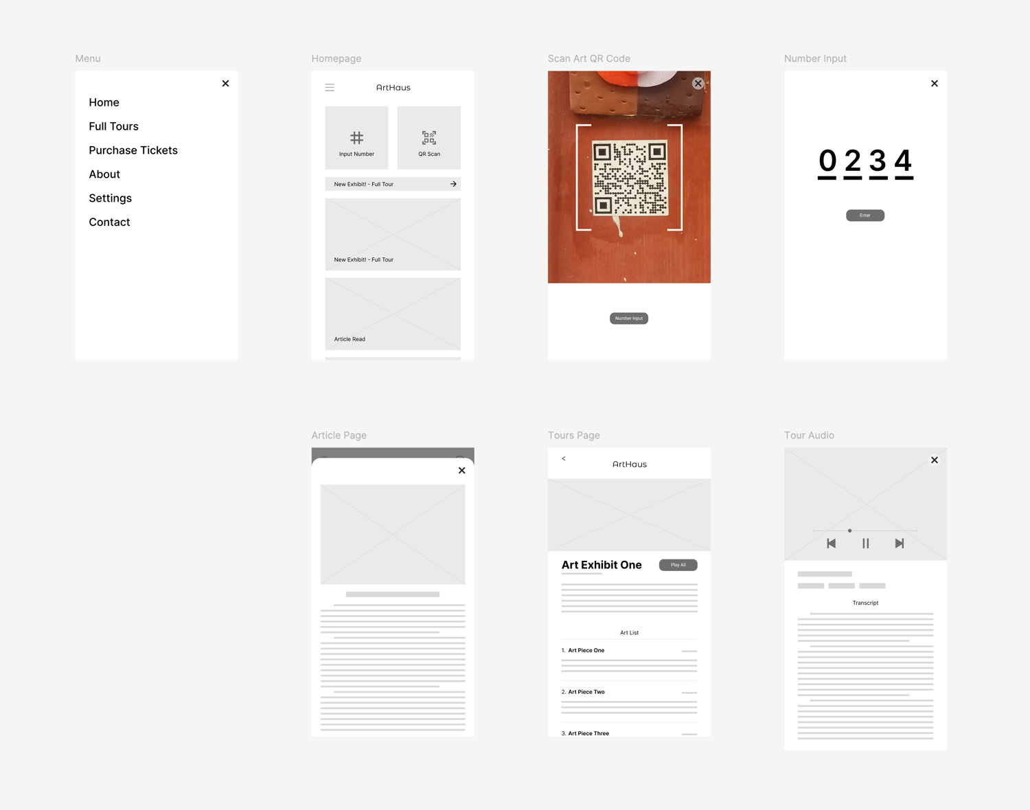
Wireframes | From the research I gathered, I wanted the app to be a companion app that won't be too much of a distraction from the actual art and museum experience. Using QR codes (and alternatively, number inputs) I designed a user flow that gets the user the content they want as fast as possible. I made the button to scan the code as prominent as possible so that users know exactly what the main action is right on the homescreen. The results of the unmoderated user studies that I performed proved the feature to be very useful.
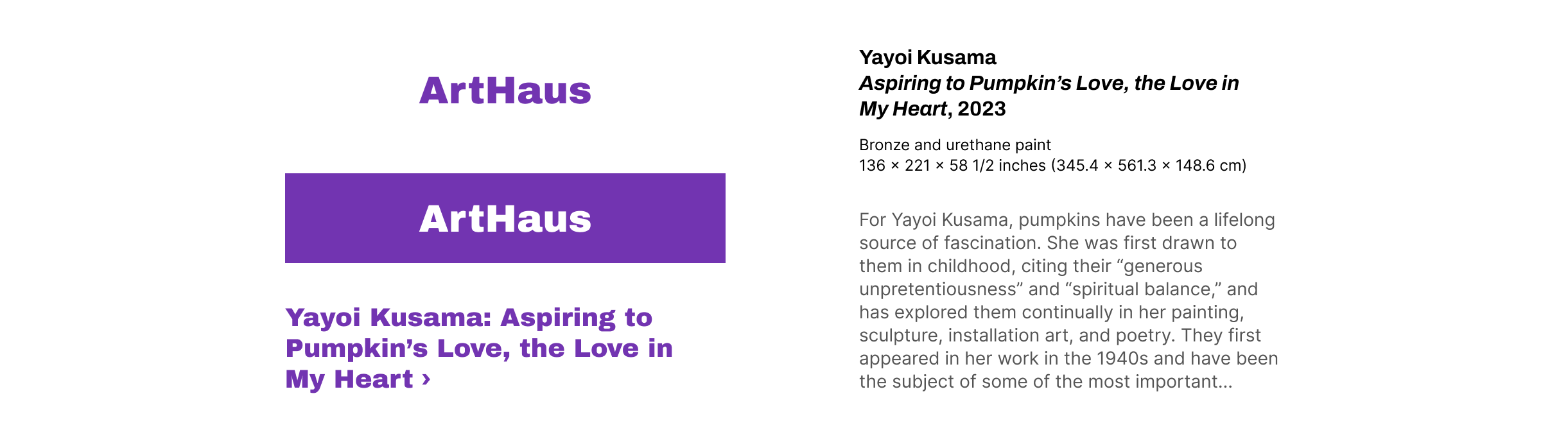
Hi-Fi Mockups | Once I've synthesized the data from the user studies, it was time to add some styling to the app. My approach to this was mainly focusing on one hip color for emphasis and let the imagery from the artwork do the rest. I used a similar approach with the font by using a bold font literally and figuratively as my headers while using a simpler more versatile typeface for the rest of the text.
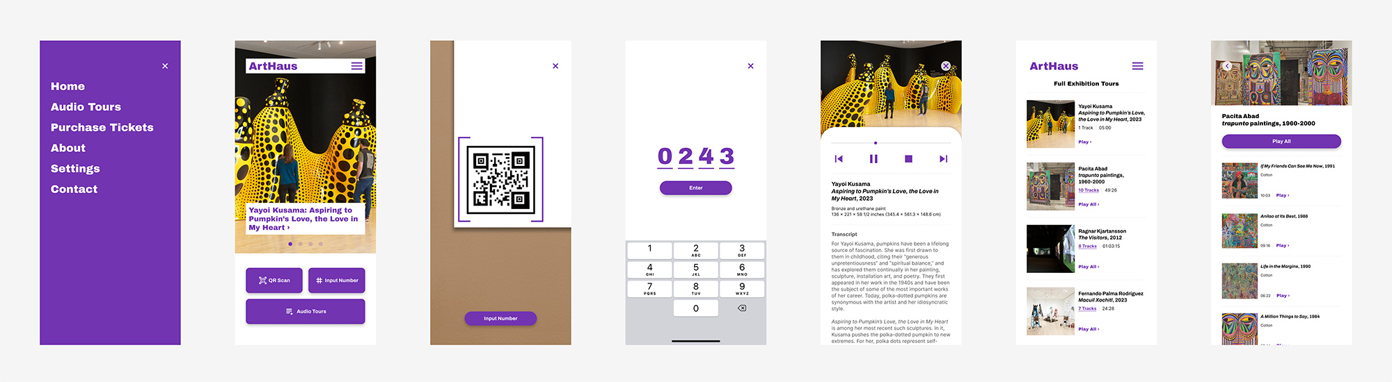
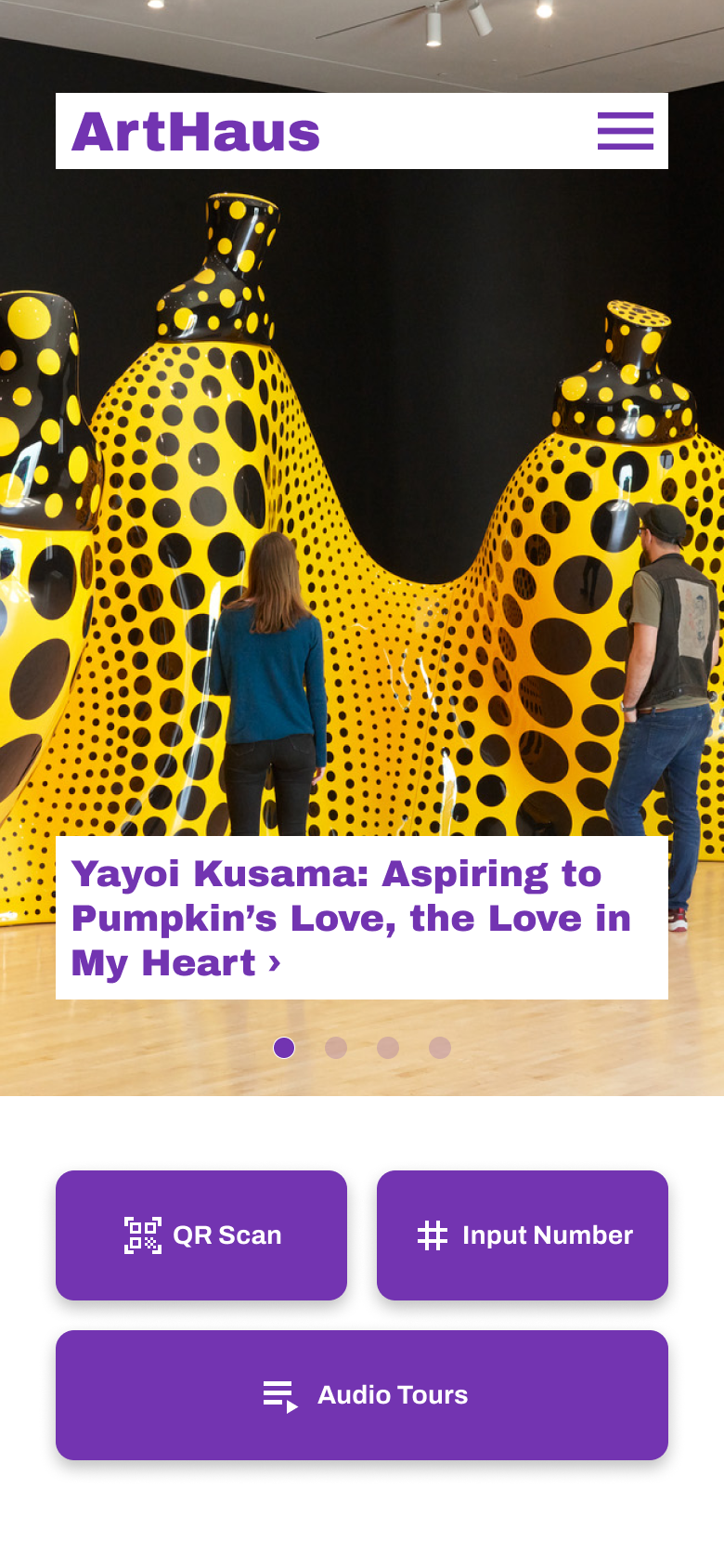
Final Adjustments and Thoughts | The next step to creating the hi-fidelity mockups was building the prototype for another round of unmoderated user study with five participants. The results from the user interviews led to make some final changes to the layout of the app. The home screen seemed to divide the attention of the user's path between using QR code scan and number input, so I chose to have the QR code path as the focus and number input as the backup if the scan doesn't work. I've changed to a more conventional bottom menu that is common in most apps giving room for a taller area for the new exhibits. The rest of the screens are fairly similar except that bottom menu is more persistent throughout the user journey.
What I've learned through this project is that once you have designed a layout, there's always room for improvement. I've found that the insights from testing is a great way to step back from your design and not be so precious with it. Key insights could drastically change the design and I am learning to not be so attached to that initial design.